

Vintage & Artistic
Risograph Editorial Still Lifes
A medium-specific artistic prompt for layered risograph texture, ink misregistration, and tactile paper still lifes.
Featured real result
What this prompt produced
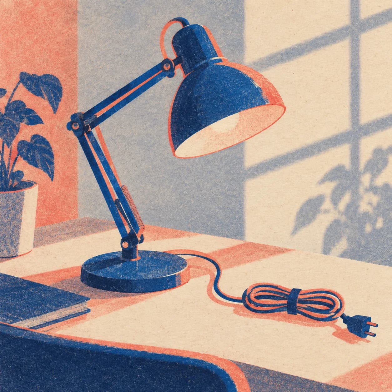
The lamp and cord hold a crisp diagonal while offset cobalt and coral inks remain visible.
The master prompt
Create a square 1:1 artistic still life of [SUBJECT] interpreted through [PRINT_LANGUAGE] on [PAPER_SURFACE], arranged as [COMPOSITION], lit by [LIGHTING], with [PALETTE]. Make the risograph process visible through limited ink layers, tactile paper grain, and restrained misregistration while keeping the subject readable. No readable text, logos, watermark, or generic sepia filter.
Visual direction
Style: Distinctive risograph print language with limited inks, grain, and tactile registration.
Lighting: Simple shadows and directional sources translate into clear printed value shapes.
Composition: Readable still-life silhouettes are organized for a small editorial print surface.
Variables
- SUBJECT — still-life subject
- PRINT_LANGUAGE — risograph treatment
- PAPER_SURFACE — paper stock
- COMPOSITION — arrangement
- LIGHTING — source or shadow
- PALETTE — ink colors
How to use it
- Choose a subject and a specific risograph process language.
- Name ink behavior rather than relying on a generic vintage label.
- Review resemblance to protected artwork before publication.
Same master prompt, different variables
Demo variations
Demo 01
a blue desk lamp and loose cord
- PRINT_LANGUAGE
- two-ink risograph with visible offset
- PAPER_SURFACE
- warm recycled stock
- COMPOSITION
- diagonal tabletop arrangement
- LIGHTING
- hard cast window shadow
- PALETTE
- cobalt, coral, paper cream
The lamp and cord hold a crisp diagonal while offset cobalt and coral inks remain visible.
Demo 02
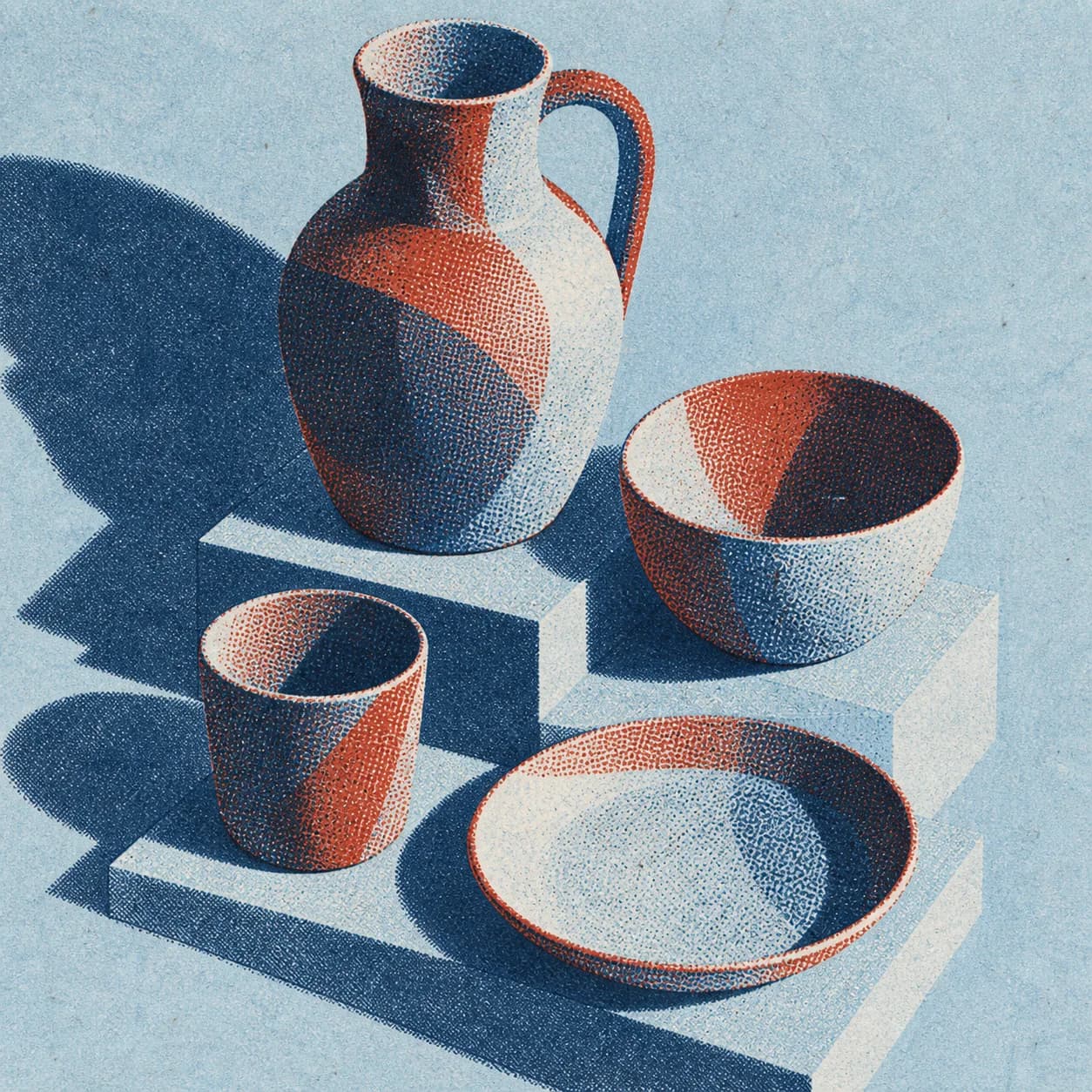
a handmade pitcher and cups
- PRINT_LANGUAGE
- three-layer risograph with soft grain
- PAPER_SURFACE
- pale blue uncoated paper
- COMPOSITION
- centered geometric still life
- LIGHTING
- simple studio shadow
- PALETTE
- brick, slate, cream
Pitcher and cups stay readable through soft grain and a centered limited-color arrangement.
Demo 03
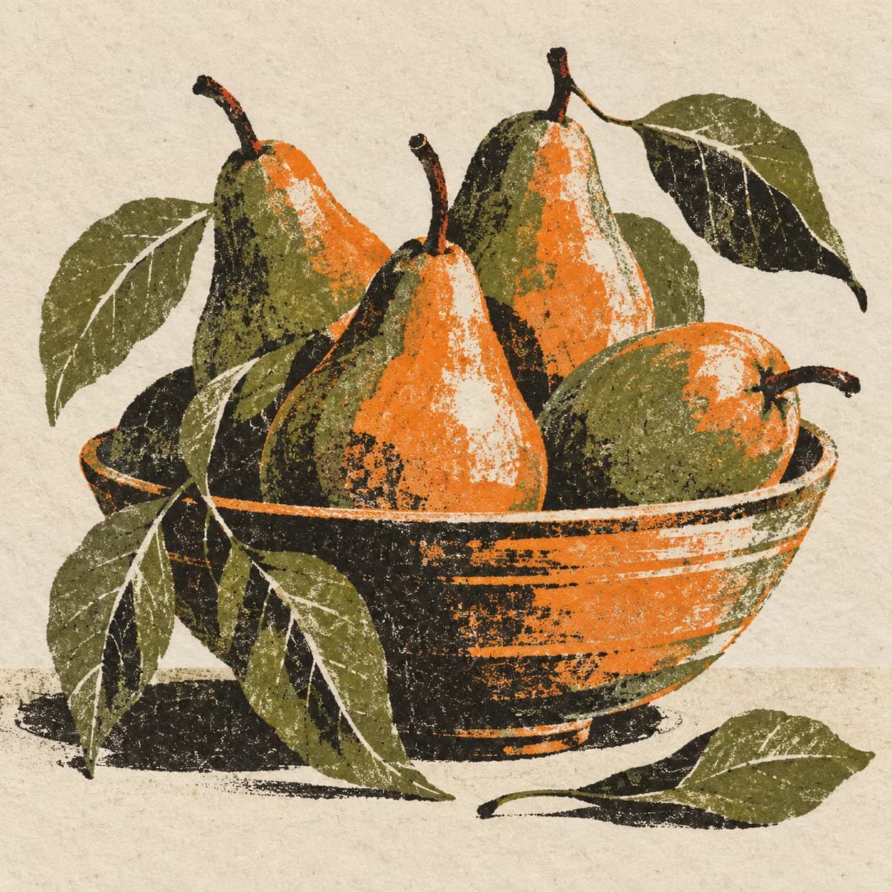
a basket of pears and leaves
- PRINT_LANGUAGE
- botanical risograph with ink overlap
- PAPER_SURFACE
- speckled ivory paper
- COMPOSITION
- arched clustered arrangement
- LIGHTING
- soft side light
- PALETTE
- leaf green, ochre, navy
Pears and leaves use overlapping botanical inks that feel printed rather than sepia-filtered.
Demo 04
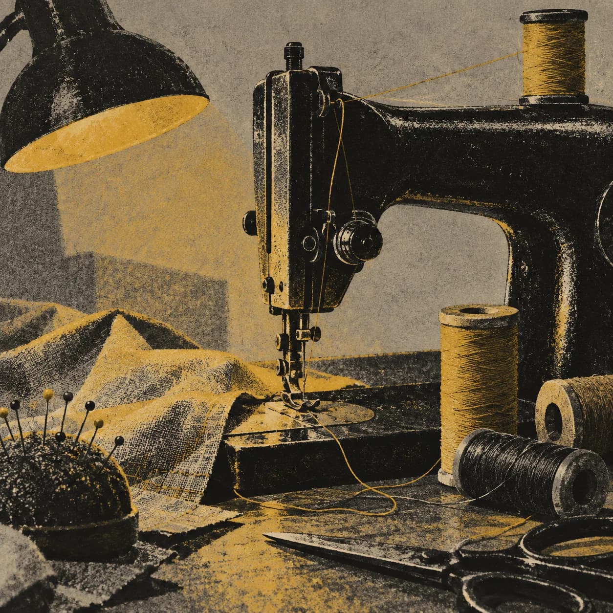
an old sewing machine
- PRINT_LANGUAGE
- duotone workshop print with misregistered edges
- PAPER_SURFACE
- gray newsprint texture
- COMPOSITION
- low three-quarter object study
- LIGHTING
- single practical lamp
- PALETTE
- black, mustard, dusty rose
The sewing machine's metal forms survive the duotone process and remain legible in workshop light.
Consistency / testing notes
Risograph processCONSISTENT
All four outputs visibly use limited ink layers, grain, or registration behavior.
Subject recognitionCONSISTENT
Lamps, ceramics, fruit, and machinery remain readable through the print treatment.
Material paperMOSTLY CONSISTENT
Paper and ink texture vary by scene while staying tactile and editorial.
All four demos use final master prompt version v1-premium-batch-five; only declared variable values changed. Four authentic generations were assessed as one set.
Tips for better results
- Limit the ink palette deliberately.
- Use misregistration as texture, not noise.
- Add exact typography in a later design pass.
Limitations
- Print registration and fine grain can vary.
- Generated lettering is unreliable.
- Review intellectual-property and attribution concerns.