

Logo Design
Organic Logo Mark Explorations
A nature-inspired logo prompt for flat organic marks with elegant contours, controlled color, and strong reduction potential.
Featured real result
What this prompt produced
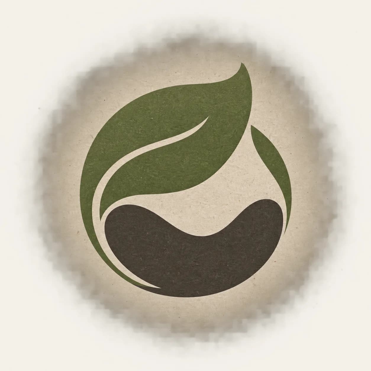
A folded seed leaf becomes a grounded flowing mark with generous charcoal negative space.
The master prompt
Create one original abstract logo mark for [PROJECT_TYPE] based on [NATURAL_SOURCE] and [FORM_BEHAVIOR], expressing [BRAND_PERSONALITY]. Present a single centered mark on [PAPER_TONE] with [COLOR_TREATMENT], elegant negative space, tactile but flat identity-study character, and a silhouette that remains legible when reduced. No readable text, letters, real logos, botanical illustration detail, gradients, shadows, watermark, or multiple logo options.
Visual direction
Style: Flat organic identity exploration with elegant contours and restrained tactile presentation.
Lighting: Soft even presentation light preserves the flat color treatment and edge clarity.
Composition: A single centered mark uses negative space and silhouette rather than illustration detail.
Variables
- PROJECT_TYPE — identity use case
- NATURAL_SOURCE — source inspiration
- FORM_BEHAVIOR — contour behavior
- BRAND_PERSONALITY — intended character
- PAPER_TONE — presentation tone
- COLOR_TREATMENT — mark colors
How to use it
- Choose one natural source and one contour behavior.
- Reduce the output to a simple vector concept before final use.
- Test contrast, one-color reproduction, and distinctiveness.
Same master prompt, different variables
Demo variations
Demo 01
a low-waste food cooperative
- NATURAL_SOURCE
- a folded seed leaf
- FORM_BEHAVIOR
- one continuous flowing contour
- BRAND_PERSONALITY
- generous and grounded
- PAPER_TONE
- warm recycled paper
- COLOR_TREATMENT
- moss green and earthy charcoal
A folded seed leaf becomes a grounded flowing mark with generous charcoal negative space.

Demo 02
a quiet wellness studio
- NATURAL_SOURCE
- a rising tide line
- FORM_BEHAVIOR
- two balanced organic curves
- BRAND_PERSONALITY
- restful and precise
- PAPER_TONE
- pale blue paper
- COLOR_TREATMENT
- deep teal and soft gray
Two tide-like curves create a restful symbol that stays precise and flat.
Demo 03
a children’s nature library
- NATURAL_SOURCE
- a simple sprouting form
- FORM_BEHAVIOR
- a playful nested silhouette
- BRAND_PERSONALITY
- welcoming and curious
- PAPER_TONE
- buttercream board
- COLOR_TREATMENT
- leaf green and indigo
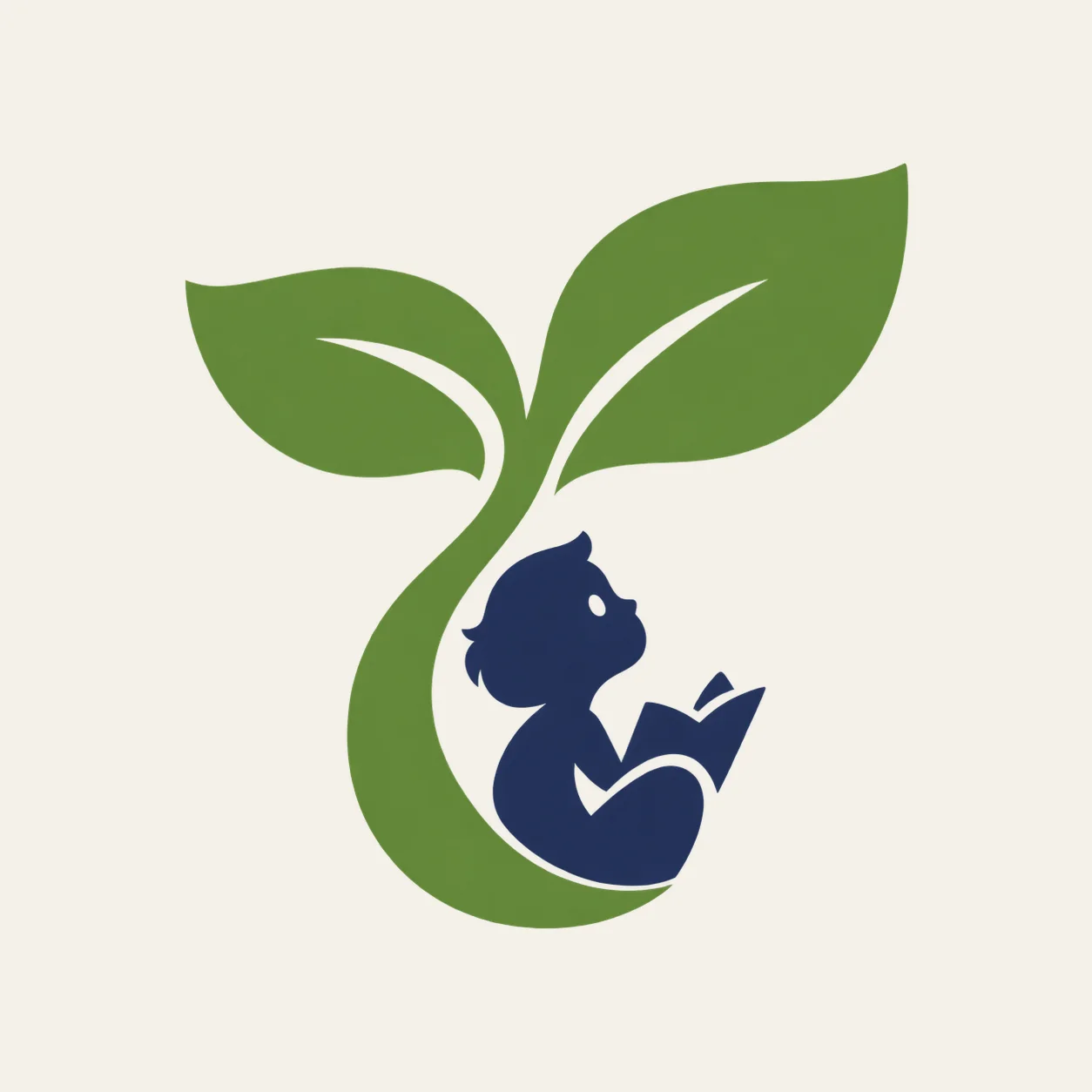
The sprouting form feels welcoming and curious without becoming detailed botanical art.

Demo 04
a creative sound label
- NATURAL_SOURCE
- a seedpod rhythm
- FORM_BEHAVIOR
- repeating rounded pulses
- BRAND_PERSONALITY
- warm and experimental
- PAPER_TONE
- dusty rose paper
- COLOR_TREATMENT
- plum and burnt orange
Rounded seedpod pulses give the sound label a warm, experimental silhouette.
Consistency / testing notes
Organic silhouetteCONSISTENT
Each mark uses a simplified nature-inspired silhouette instead of detailed illustration.
Negative spaceMOSTLY CONSISTENT
Open counters remain central, with contour density varying by concept.
Reduction potentialMOSTLY CONSISTENT
The marks are broadly reducible, while final vector cleanup remains necessary.
All four demos use final master prompt version v1-logo-design-batch-one; only declared variable values changed. Four authentic generations were assessed as one set.
Tips for better results
- Keep organic does not mean overly detailed.
- Let one contour carry the identity.
- Pair final lettering only after the mark is stable.
Limitations
- Organic contours can require cleanup for consistent stroke behavior.
- The output is a concept, not a trademark clearance result.
- Review resemblance to existing marks and illustrations.